
Colorful winter outfits are clothes built to hold saturation against gray skies and weaker light, not summer brights worn out of season. The catch is that color alone falls flat; the fabric weight and finish do the actual work. A Christopher John Rogers bold blue belted coat only reads as intentional because the wool is heavy enough to sit with formal gravity, while vinyl cherry red turns almost aggressive under cloud cover precisely because the surface catches what little light exists.
1. Bold Blue Belted Coat
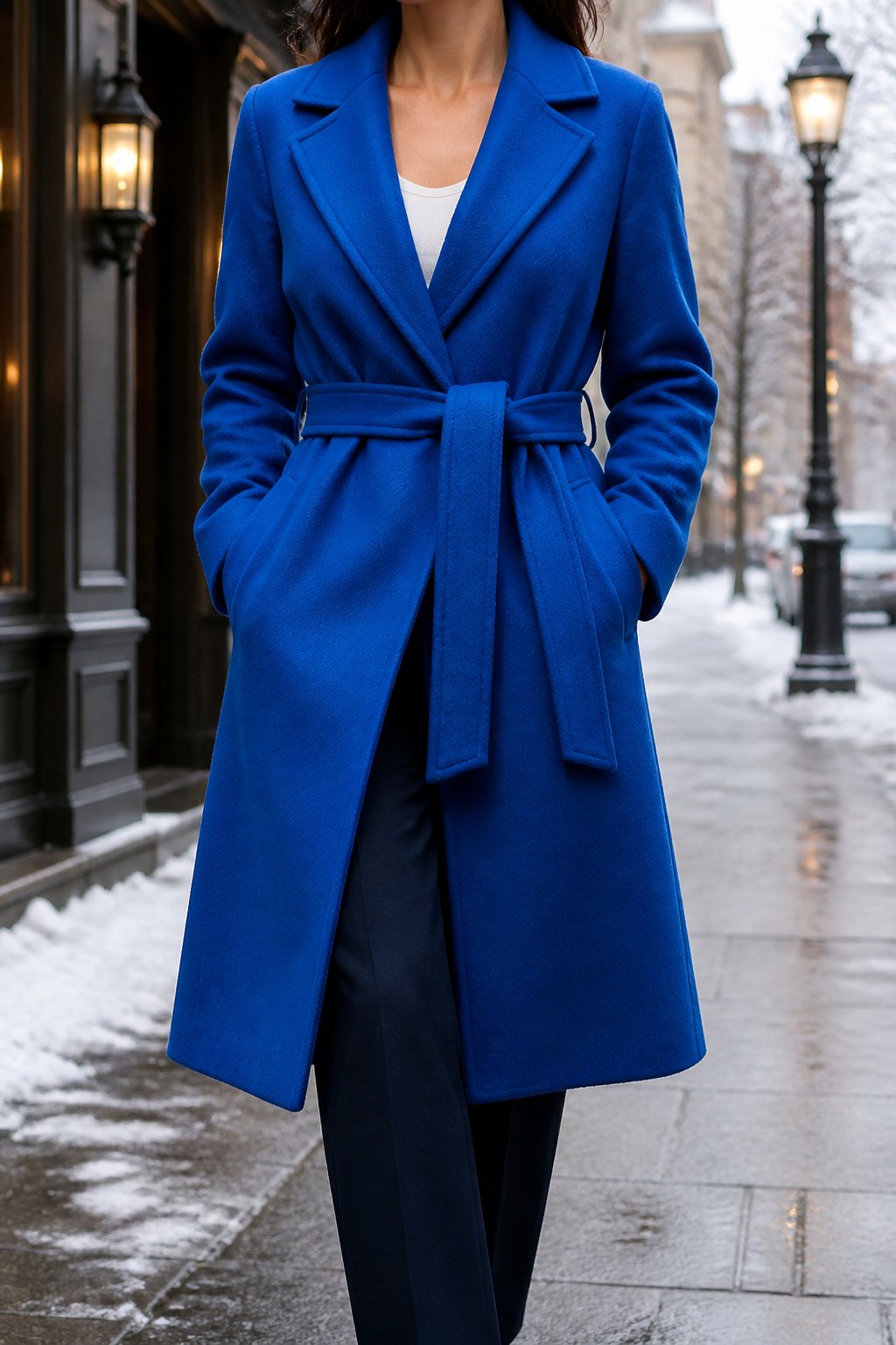
A single vivid coat does more work than any other layer in your wardrobe. The bold blue belted coat from Christopher John Rogers proves it: you throw it on over muted pieces and the whole look locks into place.
The belted wool silhouette matters in practical terms. The tie lets you cinch against wind without adding bulk, and the cut holds enough room for a thin knit underneath. Warmth and shape both survive the commute.
What you wear beneath it needs restraint. A tailored trouser in navy or charcoal, a simple tank from Totême, and you are done. Let the coat carry the color load. A crewneck in a second bright shade underneath would fight for attention and lose. Accessories follow the same rule: keep them quiet in black or tan leather so the blue reads as intentional, not accidental.
The coat is the outfit. Everything else is just weatherproofing.
2. Colorful Crewneck Sweater
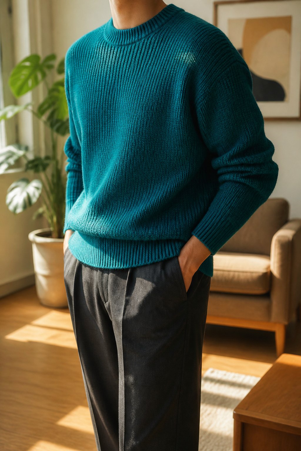
A crewneck in a saturated knit does more work than any other sweater you will own. The neckline sits flat enough to disappear under a car coat but holds its shape when the heating is cranked and you peel the outer layer off. That is the test: does it still read as intentional when it is the whole outfit?
Merino and lambswool take dye more reliably than cotton blends. The protein fibers grab pigment at a molecular level, so the teal or tangerine you bought in October still carries the same voltage after dry cleaning. Cotton knits, by contrast, fade toward dishwater by late January. The difference shows up under office fluorescents, where a cheap yarn looks tired and a good one still bounces light back at you.
The mistake is buying the color without checking the fiber content. You want a label that names the wool first, not a blend where acrylic does the heavy lifting. Acrylic pills, and pilled color looks muddy no matter how bright it started. Hand wash or dry clean; the machine cycle that saves twenty minutes costs you the sweater by March.
3. Multicolored Maxi Dress

A multicolored maxi dress does not retire when the first cold front moves through. The mistake is treating it as a summer-only piece and letting it hang in the closet until April. What makes it work in winter is the weight of what goes underneath.
Start with 80-denier tights or heavier. Anything thinner lets the wind cut through and throws off the visual balance; the dress needs a solid anchor at the ankle. Pair with a boot that has some shaft height, a chelsea or a slim riding boot, so the line stays continuous and you avoid the gap that breaks the silhouette. A cropped jacket or a waist-length puffer on top keeps the dress the focal point rather than drowning it in fabric.
The dress itself should already carry enough color to do the heavy lifting. Winter neutrals elsewhere let it read as intentional, not leftover from vacation. If the print runs warm, add a camel or rust coat. If it runs cool, navy or charcoal. The layering is functional, but the effect is the point: color in a season that defaults to black.
4. Neon Pink Suit
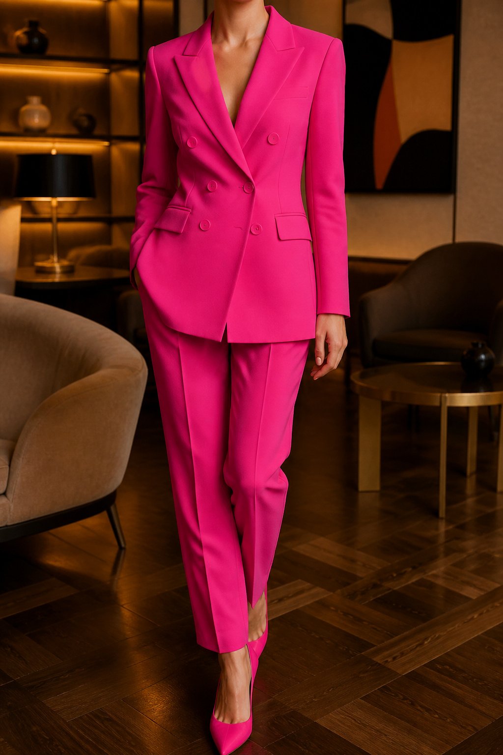
A neon pink suit only works when you wear it as a suit, not as separates. Gabriela Hearst cut hers in a dense wool that holds its shape through heated offices and hotel ballrooms alike, which is the weight you need if you are going to wear this color in January. Split the jacket from the trousers and you get two loud pieces that fight each other instead of one statement that reads as deliberate.
The fabric matters because neon pink in a lightweight cloth looks like costume. In something closer to a twelve-ounce wool, it sits with the gravity of formalwear. You will still get stared at in a navy-and-gray room, but the cut and weight signal that you chose the color, not that you are lost in it.
Where to wear it is the judgment call. A charity gala or a creative industry awards dinner works. A funeral, a job interview at a bank, or a first meeting with a conservative client does not. The risk is not the color itself; it is wearing it where the host or the room has not invited that much energy. If you are the only person in the space who dressed for joy, you have misread the room, not the outfit.
5. Cherry Red Vinyl Jacket and Miniskirt
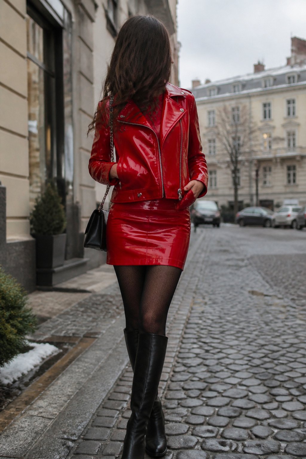
Vinyl carries color differently than any matte fabric, and cherry red in that finish reads almost aggressive against a gray February sky. The jacket and matching miniskirt work because the shine does the heavy lifting; you do not need jewelry or a loud bag. The squeak when you sit and the way vinyl clings to tights in a heated car are real drawbacks, though the heat-trapping works in your favor once you are outside. Leather breathes; vinyl seals. You will feel the difference within a block. Wear it on dry days, since the material stiffens in real cold and cracks if you fold it wrong coming indoors. The full set together risks costume, so most who pull this off treat the jacket as the statement and keep boots and layer underneath in black or a muted camel. Under cloud cover, that red turns neon-adjacent, which is exactly the point of a colorful winter outfit. You are not dressing to blend.
6. Hot Pink Jeans
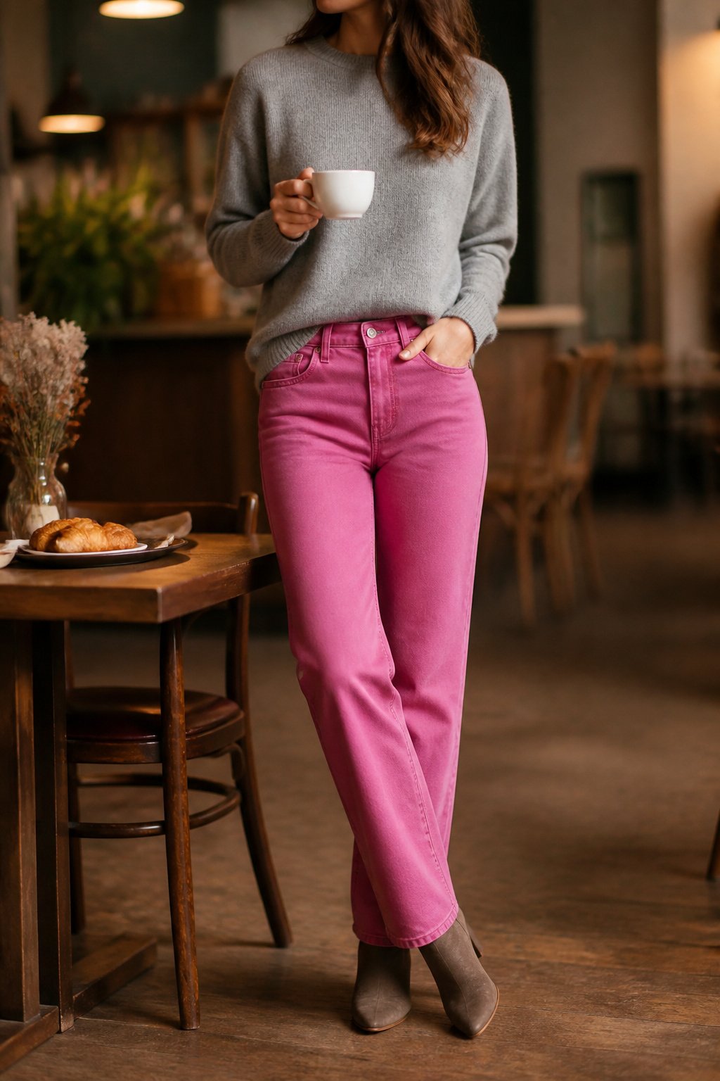
The pair that works is Cos’s straight-leg cut in a mid-rise, which sits clean at the hip without the low-slung sag that dates pink denim to novelty territory. A slim but not tight leg keeps the line modern; anything flared reads costume, and anything too skinny fights the volume of winter layers.
For the top, treat the jeans as you would indigo. A gray cashmere crewneck, a camel overcoat, a white Oxford left untucked: these are the pieces that let the color do its job without you performing it. Jewelry should be minimal. A single gold chain or small hoops; statement earrings and the look becomes "outfit" rather than clothes.
You will reach for them more than you expect. They replace black trousers on dull Wednesdays, sub in for jeans on weekends when blue feels tired, and photograph better than any neutral in gray February light. The hesitation is the purchase; the wear is easy. Once the color is in the drawer, it becomes default, not exception.
Vogue noted that even a neon pink suit can be subdued with minimalist accessories and simple jewelry.
Simple, statement jewelry from Brilliant Earth and Missoma are other neutralizers to note.
— Vogue
The same principle holds here: let the jeans carry the color, and keep everything else quiet.
7. Color-Block Mock Neck Sweater
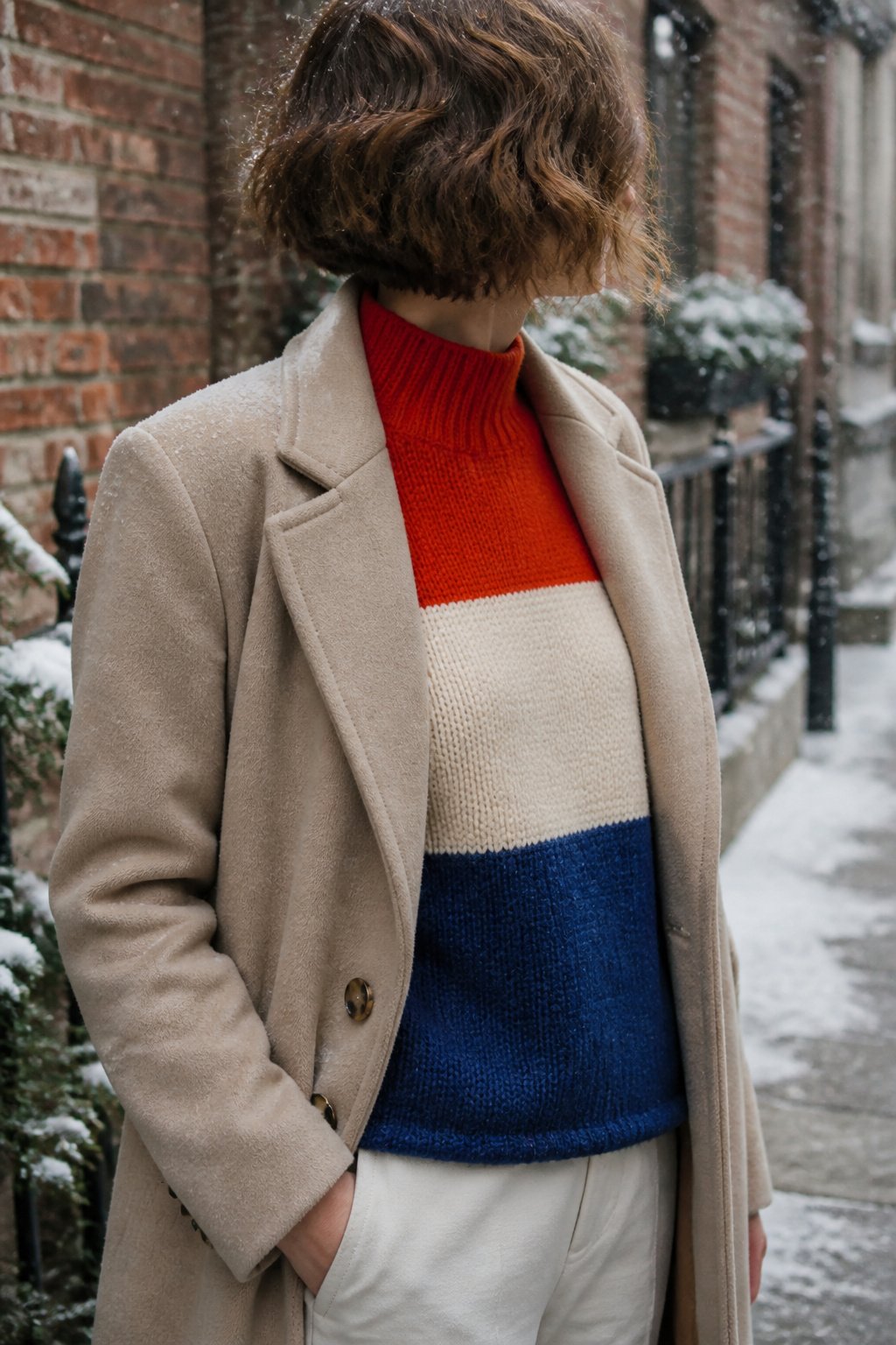
A color-block mock neck sweater carries two or three colors in one garment, so the contrast is already built in. You do not have to match anything; the piece does the work.
The mock neck sits lower than a turtleneck, which means it layers cleanly under a coat collar without bunching. You get the warmth at your throat without the bulk that fights your outerwear.
Horizontal blocks across the chest widen the upper body, which balances narrower hips. Vertical panels running down the front lengthen a shorter torso. Diagonal color breaks draw the eye across the body and work well on straighter frames that need shaping. If the sweater is mostly one color with blocks at the sleeves, the effect is quieter and the arms look longer.
Wool or a wool-cotton blend holds the shape best; all-cotton color-block knits tend to sag at the seams after a season and the geometry goes soft.
8. Striped Rugby-Style Top
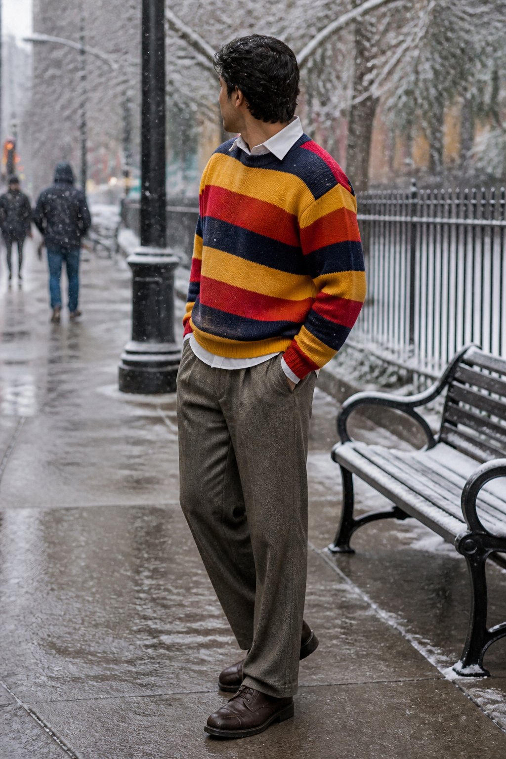
The rugby shirt started as borrowed kit from English schoolboy matches, but the winter versions you want now come in heavy cotton jersey or a dense wool knit that holds its own against a coat. That weight is what moves it from autumn layering into real cold-weather territory. Horizontal stripes across the chest read wider than vertical ones, which flatters narrow shoulders but can overwhelm a broader frame if the bands are thick. You will notice the difference between a one-inch stripe and a three-inch one when you try them on. The mistake is treating it like sportswear and throwing it on with track pants or cargo trousers. It works better with tailored pants, wool flannels, or a pressed chino, the structure balancing the shirt’s casual DNA. The collar is substantial enough to sit over a crewneck sweater, but the whole thing collapses into sloppiness if the pants are too soft. Think of it as menswear with color, not as a costume of the game itself.
9. Pink Fur-Cuffed Coat
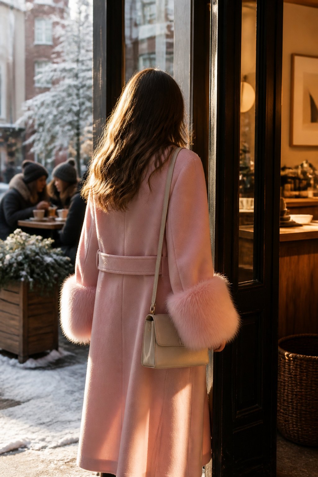
A pink fur-cuffed coat lives on the boundary between statement piece and daily wear, and that boundary is where most of the problems sit. The cuff places texture exactly where your hands move, which means the eye travels there constantly: great for a held bag or a gestured greeting, but the motion also matts the pile over time.
Real fur trim demands cold storage and professional cleaning between seasons; faux fur tolerates a home wash but tangles in heat, so you dry it flat with the nap brushed out while it is still damp. The difference in upkeep is not slight, and it shapes which version you will actually wear past January.
The color reads softer in photographs than it wears. Camera sensors flatten the pink into a uniform wash, but in daylight the coat shifts between warm and cool tones depending on the angle and the sky. What photographs as a gentle blush can look almost coral on a gray morning, and that inconsistency surprises people who bought it for the image they saw online. You notice it most when someone else is wearing it and the light catches the cuffs from behind.
10. Colorful Accessories
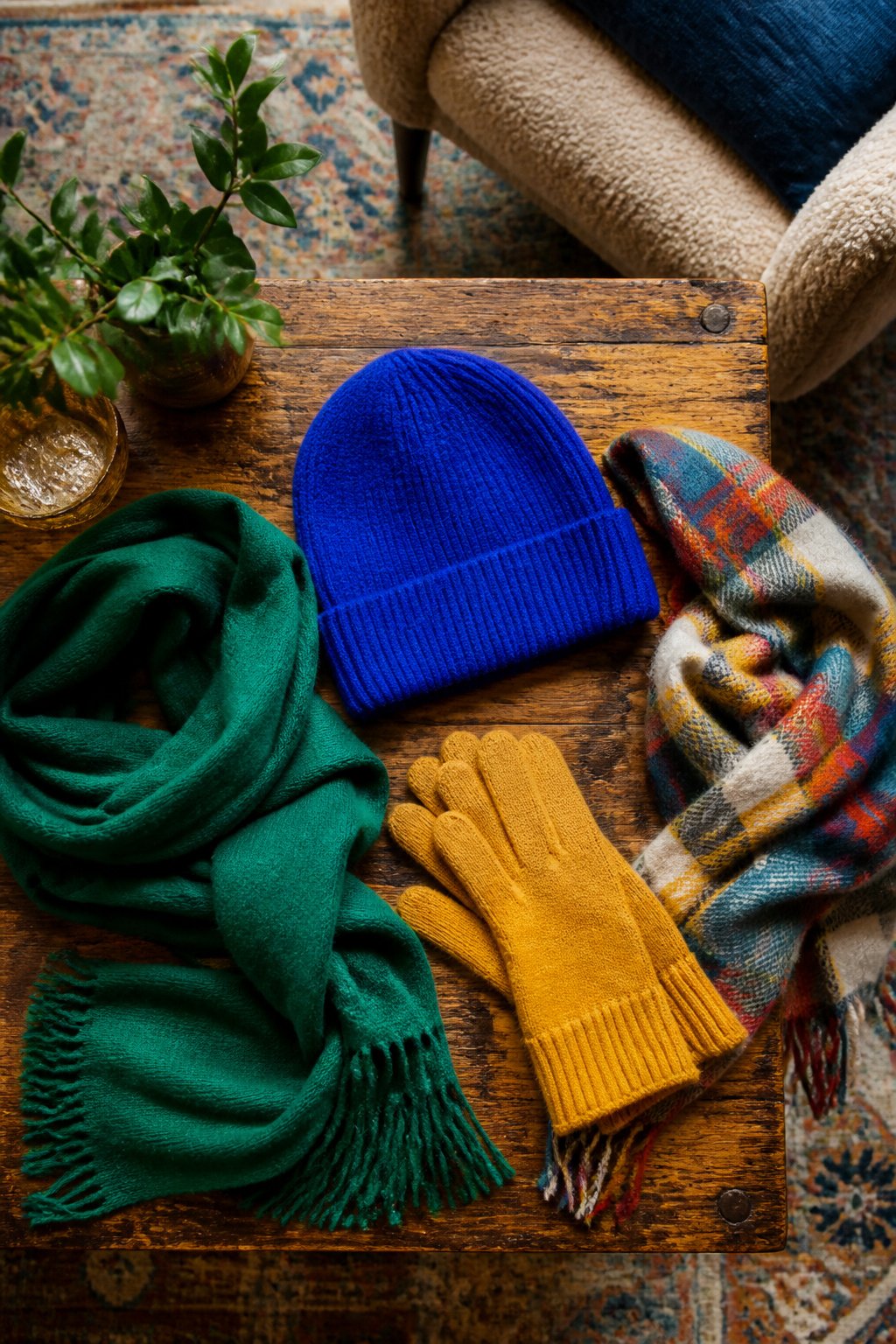
A bright hat does more for your face in January than most makeup tricks, because flat winter light erases shadows and leaves skin looking dull. Pull on a saturated cobalt or rust beanie and you instantly get the contrast back.
Scarves and gloves are the cheapest way to test a color you are not sure about. Wool holds dye more aggressively than cashmere, so a wool scarf in emerald or mustard reads louder than the same shade in cashmere, which softens into something closer to a neutral. If you want the color to do the work, pick wool. If you want the texture to matter more, cashmere wins.
The mistake is treating accessories as afterthoughts you grab on the way out. Stick to three colored pieces max, and make one of them repeat a tone already in your coat or sweater. Two brights plus one echo looks intentional. Three random brights looks like you dressed in the dark. A red hat, red gloves, and a navy coat with no red anywhere else is a move. A red hat, yellow gloves, and a teal scarf is noise.
Layering With Cashmere and Bright Knits
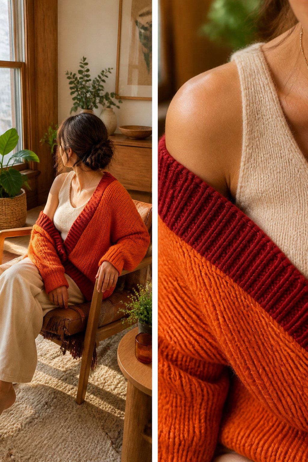
Cashmere sits against the skin in a base layer that warms without bulk, which is exactly what you need when the bright sweater goes on top. A cashmere tank or short-sleeve tee in a tone close to your skin keeps the line smooth so the color you actually want seen, the vivid knit, reads clean and intentional.
The bright sweater itself is the statement. A color-block mock neck in a bold yarn does the heavy lifting for the outfit; it is what people register first when the coat comes off indoors. The coat is the frame, not the picture. Pick one that complements rather than competes, because the whole sequence only works if removing layers reveals color rather than hiding it.
Each layer must hold up alone. The base layer cannot look like underwear if you end up in just that and the sweater. The sweater cannot be a compromise you are relieved to cover. Build the stack so that every possible combination of on and off still leaves you dressed.
Statement Coats as Focal Points
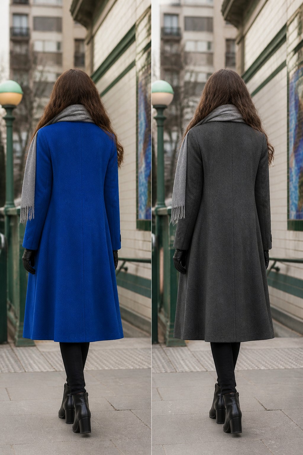
A single loud coat lands harder than three brights wrestling for attention. The eye needs somewhere to rest, and a cobalt or cherry shell against neutral everything else reads as a decision, not a costume. Let the coat do the work and keep the scarf, gloves, and bag in the same quiet register: camel, gray, navy, black. Leather in a matching tone works better than a competing texture. You are building one exclamation point and a lot of commas. The common mistake is adding a bright hat or printed bag because the coat feels too plain alone; resist it. A thin ribbed beanie in the coat’s own color can extend the shape upward without starting a second conversation. If the coat hits at mid-thigh, a boot in the same shade underneath keeps the column unbroken. The result is color that feels controlled enough for a Monday morning, not just a styled shoot.
Mixing Matte and Shiny Fabrics
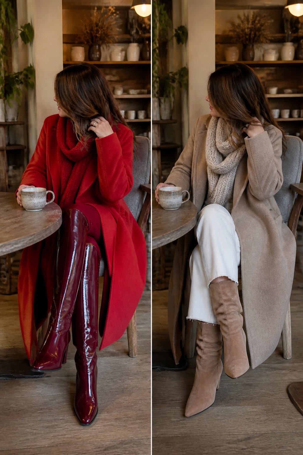
Matte wool against vinyl or patent leather gives colorful winter outfits the depth flat fabric cannot achieve alone. When you wear bright color from head to toe in a single texture, the eye reads it as cheaper than it is, like a uniform or a costume. Winter light is weaker and lower, so shine behaves differently than in summer. Patent leather catches the gray sky and throws it back in small, hard points, while matte wool drinks the same light and goes softer. The contrast between the two keeps the color from flattening into one block.
Try a scarlet wool coat with a burgundy vinyl boot, or a cobalt crewneck with navy patent loafers. The colors stay close enough to harmonize, but the surfaces fight just enough to hold interest. Without that tension, you are wearing paint, not clothes.
Color Psychology in Gray Months
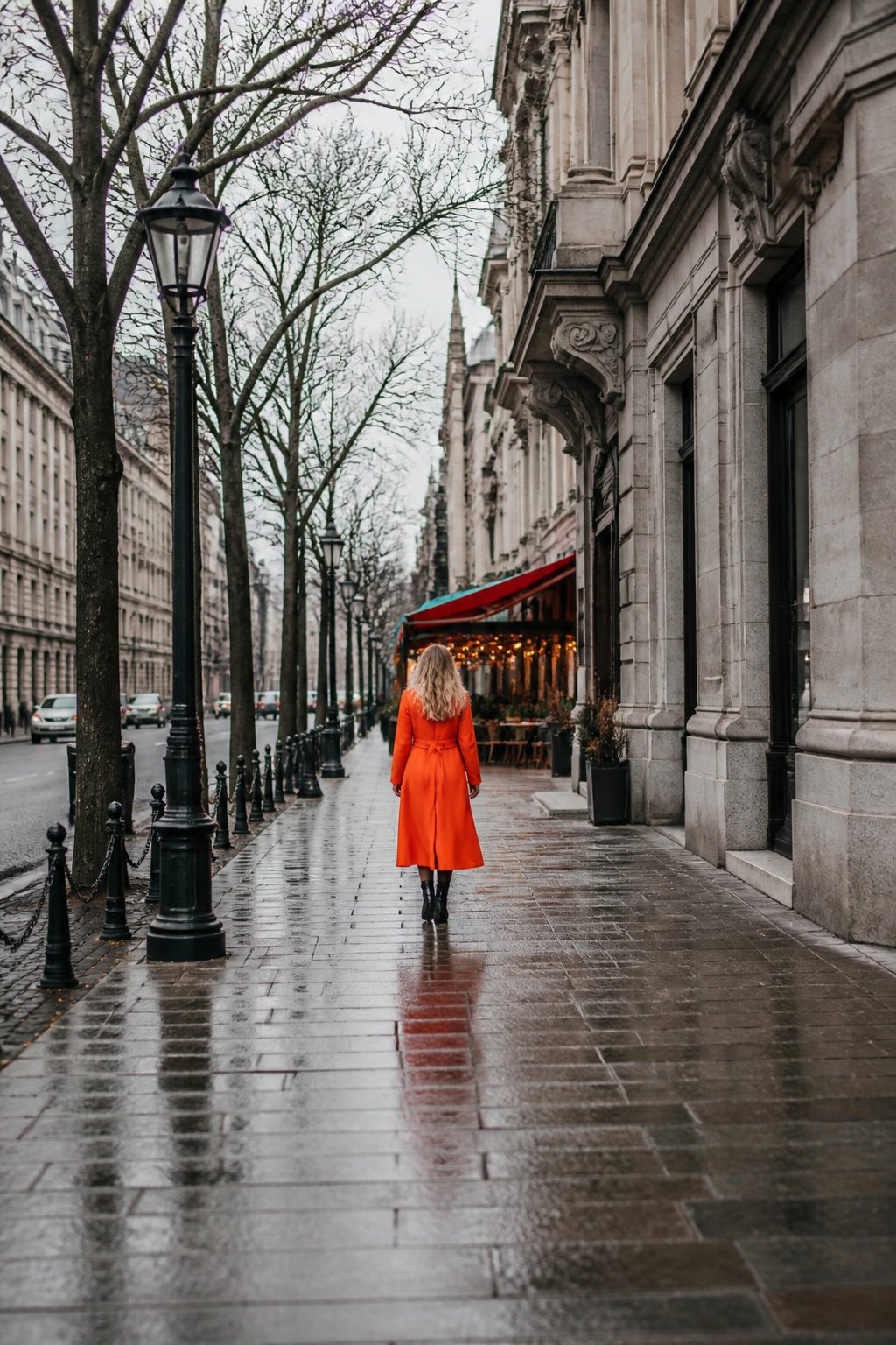
You reach for black or navy in January because it feels safe, and by February every sidewalk looks like the same muted stripe. The color you wear does not just change your mirror reflection; it changes the day you move through.
Color has the power to energize and uplift. That is not a feel-good slogan. It shows up in how strangers read you at a glance, in whether a colleague stops to talk in the coffee line, in how often you catch your own eye in a shop window and straighten your shoulders. A saturated tangerine dress or a Bottega Veneta-green suit does not work because you believe it will; it works because the human eye is drawn to contrast, and gray February offers almost none. You become the point of interest in the room not by effort but by wavelength.
The effect is measurable in motion, not just mood. You walk differently in a color that registers from thirty feet away. You are more likely to be remembered, more likely to be addressed first. The SAD lamp on your desk helps your brain chemistry; the hot-pink scarf or magenta corduroy does the same work socially, broadcasting alertness in a season that wants to dull it.
Frequently Asked Questions
How do I add color to my winter wardrobe?
Start with one statement piece like a bold belted coat or a saturated crewneck sweater, then keep everything else neutral. Accessories are the cheapest entry point: a bright wool scarf or beanie adds color without commitment, and you can test a shade before buying a larger item.
What are some colorful winter outfit ideas?
Try a bold blue belted coat over navy trousers, a multicolored maxi dress with 80-denier tights and chelsea boots, or a neon pink suit worn as a full set rather than separates. A color-block mock neck sweater or a cherry red vinyl jacket with black layers underneath also works for real cold.
Can I wear bright colors in winter?
Yes, and January through March is arguably when they do the most work. Gray light flattens everything, so a saturated coat or vivid knit becomes the point of interest in a room by simple contrast. The effect is social as well as visual: color broadcasts alertness in a season that dulls it.